Rescue has been the company’s flagship product for almost 25 years. Its Desktop Technician Console enables technicians (support agents) to efficiently provide remote support, troubleshoot issues seamlessly across various environments. Rescue's main customer base is Enterprise and GSI including HP, Best Buy, Lenovo.
LogMeIn Rescue
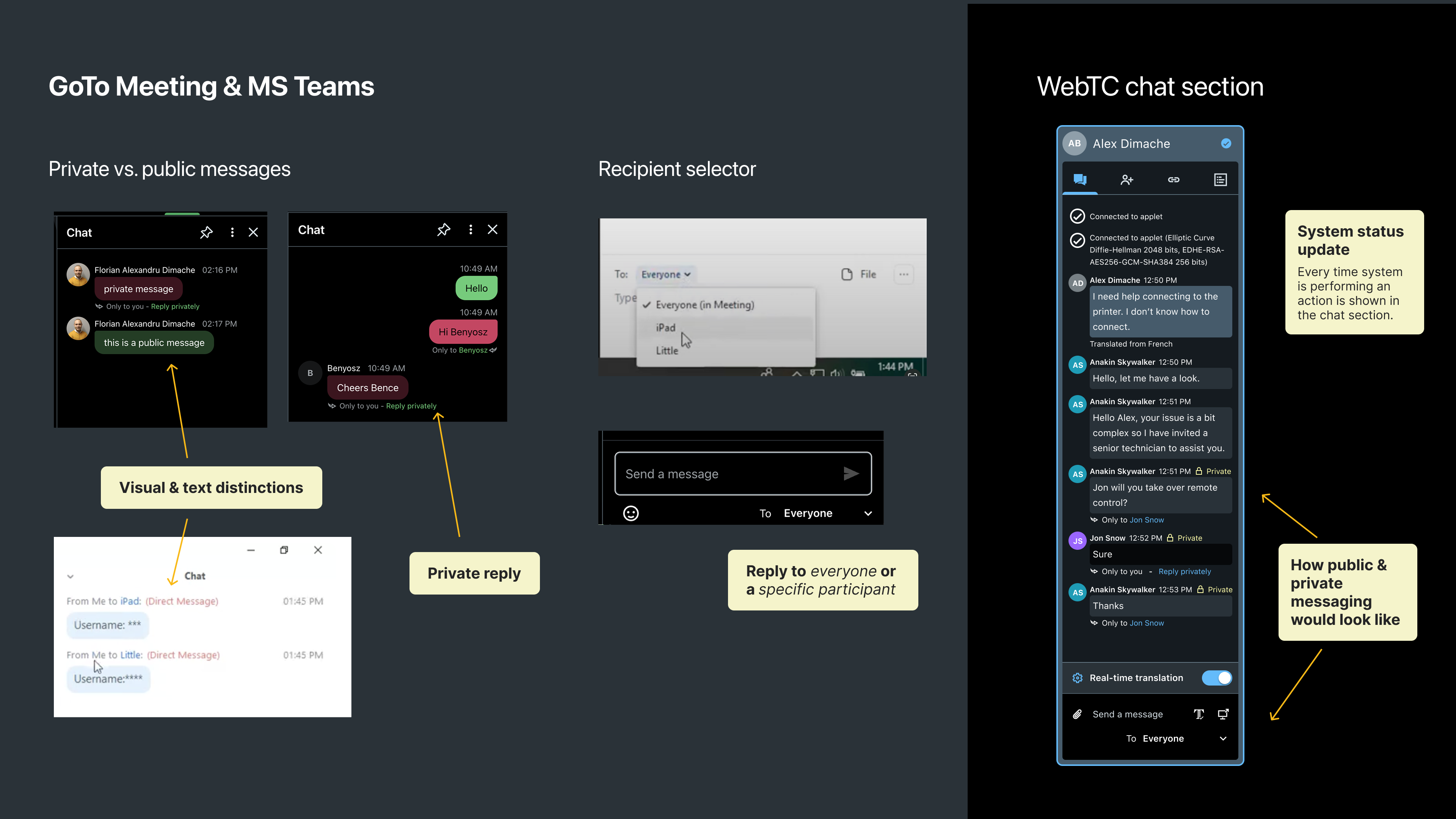
In-Session Collaboration
Adapting complex desktop features for a web-based environment.


