LogMeIn Rescue
Reusable UI elements
The complexity of adding new UI elements

Why stick with me?

I know you have a lot of portfolios to review—it’s time-consuming. So why is this one worth your time?

Nobody said, but it was expected to be easy: The Sidepanel component was introduced as a reusable layout solution to address spacing constraints and support a scalable, efficient UI across WebTC. Yet during one project, I encountered a scenario that challenged its legitimacy and exposed limitations we hadn’t anticipated.

Project Summary

Some projects shown contain confidential information and should not be shared or discussed outside of this review.

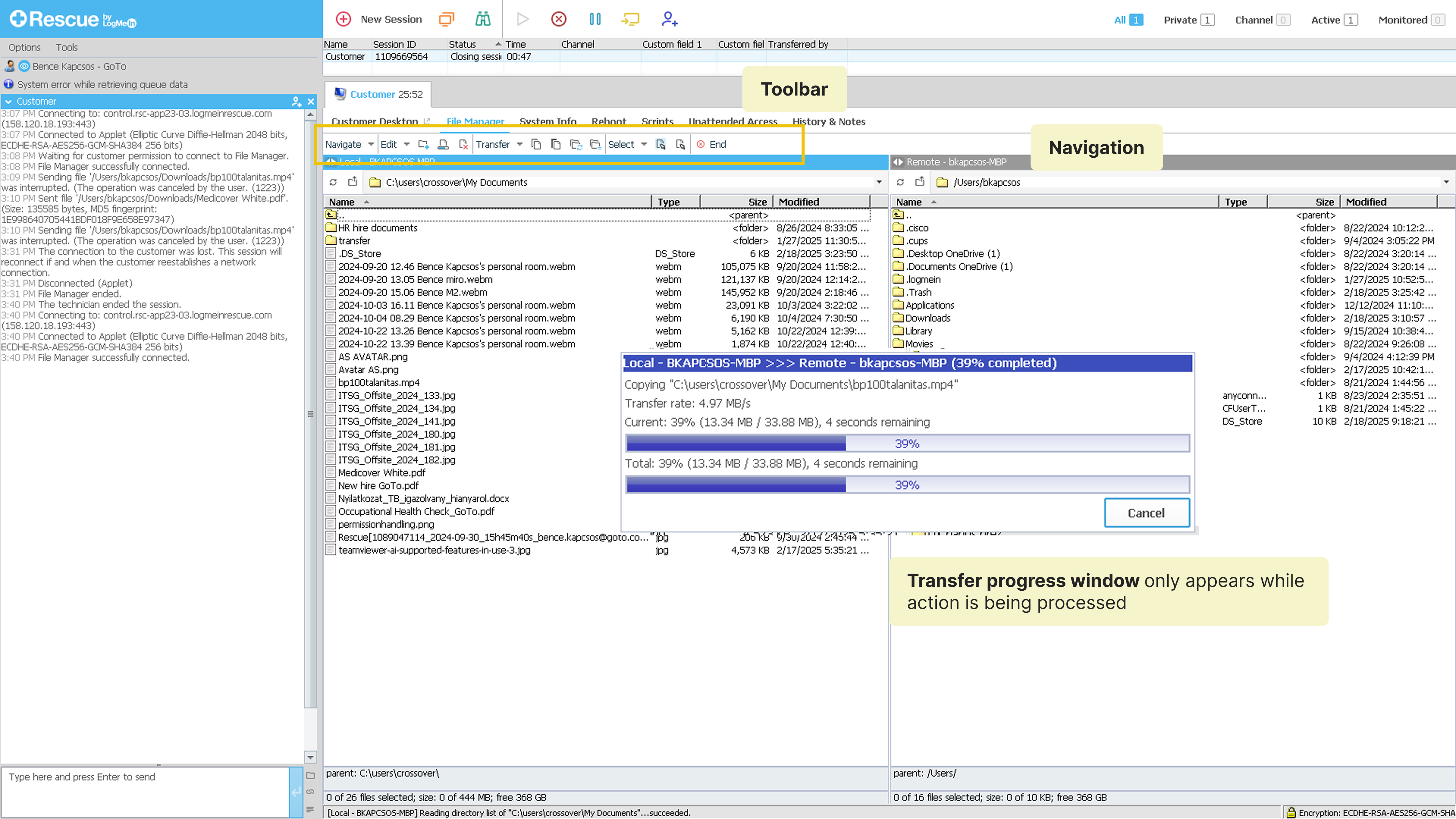
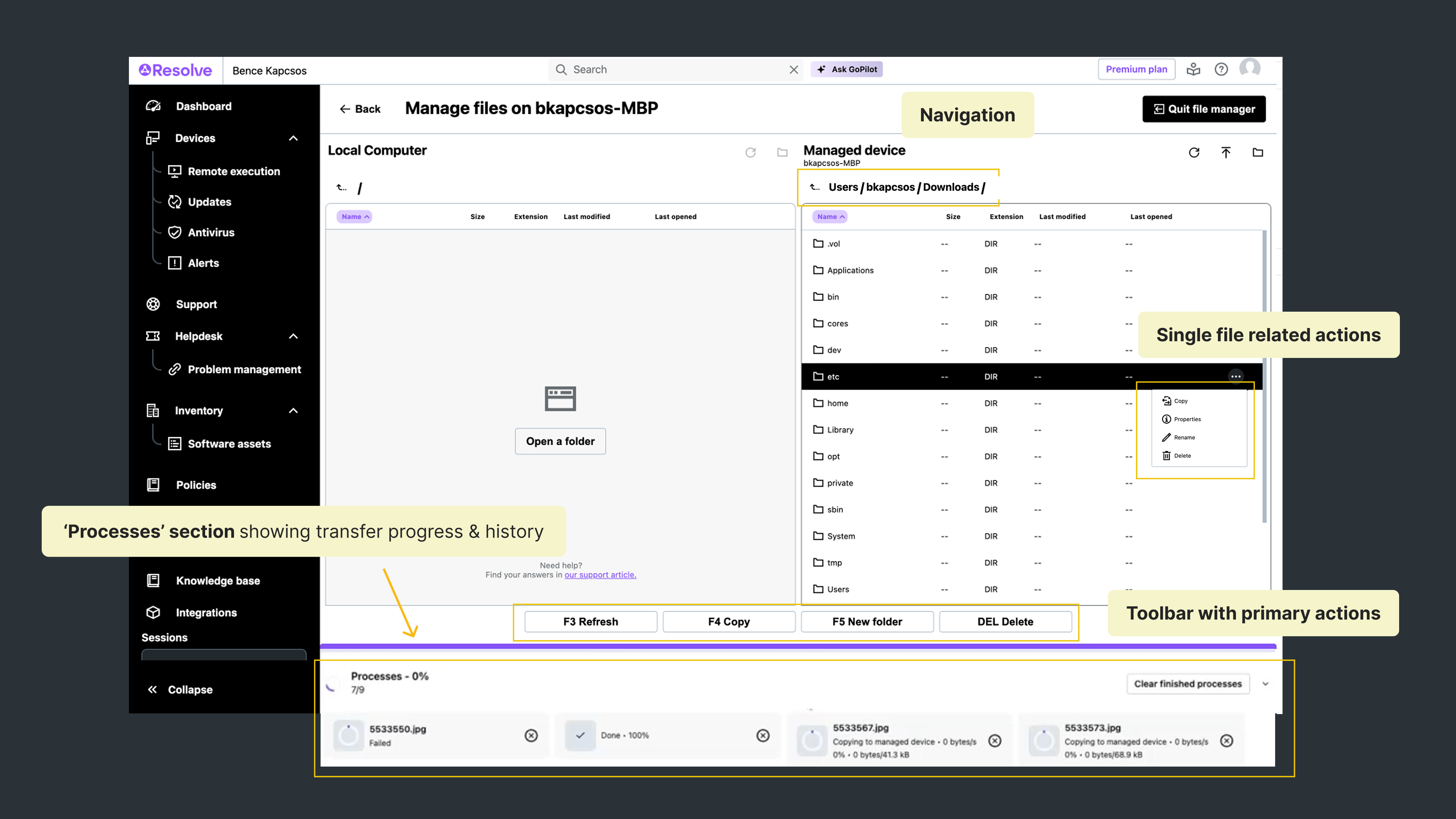
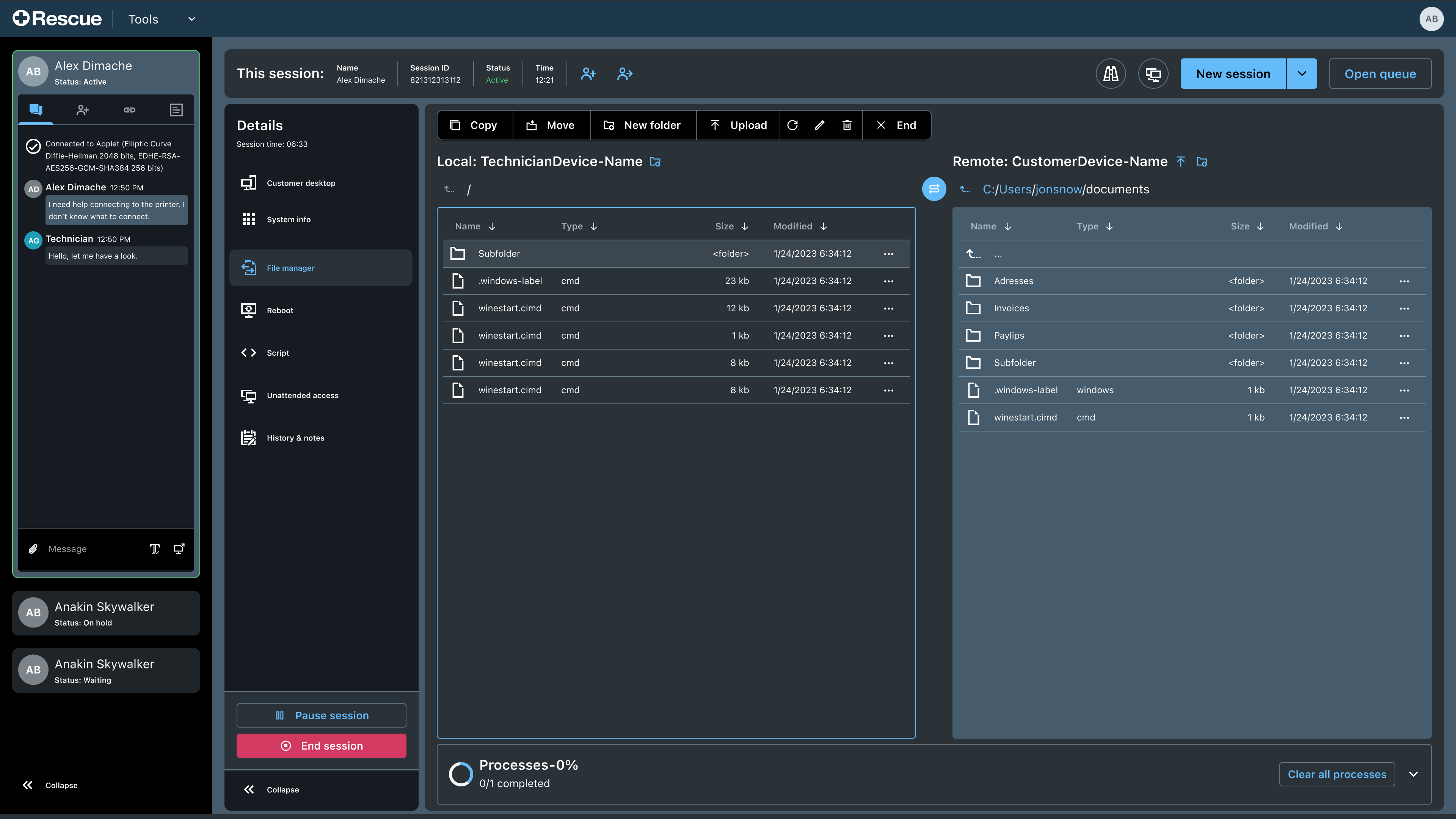
Rescue has been the company’s flagship product for almost 25 years. Its Desktop Technician Console enables technicians (support agents) to efficiently provide remote support, troubleshoot issues seamlessly across various environments. Rescue's main customer base is Enterprise and GSI including HP, Best Buy, Lenovo.

Rescue launched the Web Technician Console (WebTC), a web-based version of the product, aiming for near-complete feature parity with the desktop version. The feature adaptation is a multi-year process, prioritizing features based on importance.

My role

This case study touches on two separate project: the WebTC implementation of In-session Collaboration and File Manager features. In both cases, as a Product Designer, I led the UX delivery process, translating PM briefs into new designs while incorporating feasibility feedback from Engineering.

First act: Invitations

Improving the 'Invitation' flow for Collaborations

The invitation flow was originally a two-step process within a single dialog, requiring excessive scrolling. To improve focus and usability, I redesigned it as a sequential two-step flow, allowing users to complete one action at a time.

Additionally, instead of keeping it in a dialog, I proposed moving it to the Session Container, which serves as the central hub for secondary session features like chat and collaboration. This integration not only enhances consistency but also ensures a more scalable and intuitive user experience.

Rescue's Dektop Technician Console
My first design for the Web Technician Console

The challenge of scalability

The initial design worked well for one or two Technician Groups (assigned by admins). However, during our first design review with Product Managers, we identified a key scalability issue:

In complex cases with multiple sub-group space constraints made it difficult to display technicians efficiently.

This challenge prompted us to consider long-term scalability, ensuring Web Technician Console could support future expansions without recurring UI limitations.

Sidepanel: The scalable solution

To address this, we explored a more flexible UI component—the sidebar panel, already in use at one place in WebTC. It is important to know that LogMeIn Rescue's WebTC itself doesn't its own all-around Design System. It means that sometimes we need to add new elements. We are aiming for consistency with GoTo's Chameleon DS, however, this freedom leaves us place to possible improvements or customized solutions to the domain.

In this case, leveraging the sidepanel element brought multiple benefits:

✅ Expanded screen real estate enabling a larger list display.

Allowed technicians to monitor the UI while multitasking (e.g., replying to chat without disruption).

Established the side panel as a reusable component for future multi-step flows

By adopting this solution, we not only solved the immediate scalability issue but also future-proofed the UI for upcoming feature adaptations.

On the sidebar groups with multiple subgroups can be displayed easily
The technician can monitor the UI and reply to messages
The sidepanel is now leveraged in multiple feature & flows

Second act -File Manager

Al looks good - then comes File Manager

The sidepanel's structure and behavior was defined and worked seamlessly accross the first few features we implemented it (e.g. New Session creation, Session Transfer). The panel has an opened and collapsed state, CTAs for primary & secondary actions (mainly conitinuing or going back) while the flow can be cancelled by the X icon in the top right corner.

It was in case of another project when I come accross a situation where while using the Sidepanel still offered its benefits the above behavior couldn't be applied one-by-one.

The File Manager project

Before diving into the issue, here’s some context: File Manager is a key feature of the Desktop Console and was next in line on the roadmap for web adaptation. As the Product Designer, I led the UX delivery—translating product briefs into actionable designs while closely collaborating with Engineering to ensure feasibility throughout the process.

What is File Manager in Rescue?

Rescue's File Manager is used to remotely access, transfer, and manage files and folders between the technician's computer and the end user's device during a remote support session. It allows technicians to upload, download, delete, rename or move files to resolve issues efficiently.

In order to optimize development resources a decision was made to build our feature based on File Manager of another GoTo product, Resolve which is an IT support and management platform launched a few years ago. Our aim was to adopt features or solution that work well in Resolve but also to tailor-made it to Rescue's existing solution and customer base (Rescue is Enterprise and GSI focused where Resolve's target is SMB & Mid-Market).

File Manager in Rescue DTC

Tailoring the feature to Rescue

When implementing File Manager in WebTC we had the following three goals in mind:

Adapt the Processes section The processes section provide an upgrade to Rescue's DTC where processes already shown on a progress pop-ups. Resolve'solution works as a kind of history.

Add actions next to files & devices Follow Resolve's solution to put the most crucial actions under a menu next to the files so that technicians could save time by avoiding going back&forth over the screen

Clean up the interface Hide or remove unnecessary information of functions that are duplicate, use icons only for less important functions and rely more on well-established mouse-keyboard interactions

Resolve's File Manager

Luckily, the 'Processes' section was feasible from a technical perspective, however, the team disagreed with hiding the property under menu as it goes against industry best practices and customer's mental model. As removing it would make a prerecquisite for placing the Processes section on the bottom, it led me to rethink the approach or replace the section by moving the feature to the sidepanel component.

To address this, we explored a more flexible UI component—the sidebar panel, already in use elsewhere in WebTC.

The Challenge

Grain of sand in the UX machinery

The sidepanel has an expanded and collapsed state. The latter is designed to allow the user to handle other issues on the rest of the interface. In this case, however, the sidepanel can easily become an annoyance and it's likely that technicians wish to put them away after a while.

New pattern for cancelling actions It may be confusing to users that by closing the sidepanel, the actions are not cancelled, only the sidepanel gets 'hidden'.  

Too tedious to close collapsed sidepanel If not multiple files are transferred at the same time, the sidepanel becomes useless soon. It costs a user one extra click to make it disappear.

No way to revoke data Once the sidepanel is closed, the current logic doesn't allow a technician a way back to the previous state. The sidepanel appears again only once new action is started.

Closing mechanism - collapsed & expanded state

Two possible solutions

Toolbar element with fixed positon

Being in the top-right corner of the central stage it seamlessly fits into the Toolbar area.

A floating element

A floating UI element placed in the center-bottom part of the central stage.

Toolbar version
Floating version

Space is a UI constraint again

Since the new UI element also functions as a progress indicator, it needs to accommodate a specific amount of text and icons. However, its minimum width is relatively large due to the number of characters required. As a result, it doesn’t fit on smaller screens, creating layout issues.

While the majority of our users work on larger monitors, approximately 15% access WebTC on smaller screens.

Adopting a responsive state could theoretically solve the issue, but in this case, it comes with clear drawbacks. We need to display a spinner to indicate ongoing actions—but without a label, users lack the context to understand what the spinner represents.

The Action indicator needs to display various info
Issues on smaller screens

The floating version is the winner

I have come to the conclusion that the floating element allows us the most flexibility with info display. Even in case of smaller screens with opened navigation rails it's not a significant disturbance. A similar floating panel is used at Remote Viewing, so it wouldn't be an unconventional solution for users either.

Regarding the behavior, if the technician clears the list of actions the floating element disappears, offering a cleaner UI.

The final solution

Takeaways and lessons learned

Through this project, I gained valuable insights into adapting complex desktop features for a web-based environmentwhile balancing usability, scalability, and technical feasibility.

User-centered decisions must balance multiple constraints – This project reinforced that great UX doesn’t exist in a vacuum; it requires balancing user needs with technical feasibility and business goals. Every interaction decision had to support both immediate usability and long-term scalability — making thoughtful trade-offs essential.

Constraint-driven design leads to innovative solutions –  The sidepanel’s limited space challenged me to rethink how we present dense functionality. By refining layout, prioritizing actions, and simplifying user flows, I turned spatial constraints into opportunities for clearer, more focused interactions.

Want to see more?
Check out my next case study about reimaging the sales journey for Vodafone's fixed services.